Puzzle Center – Brand Identity & Social Media Management
Project Overview

During my time living in Israel, I partnered with a colleague who had established a cultural and community center called “PUZZLE.” While the brand originally focused on serving a Russian-speaking community, my primary role was to expand our reach and bring in Hebrew-speaking Israeli clients.
The center serves as a vibrant cultural hub for children, offering language development, art classes, sports programs, seasonal holiday events, and birthday parties. My mission was to adapt and design a cohesive brand identity that would resonate with the local market, while handling our digital marketing and client acquisition.
The Challenge & Strategy

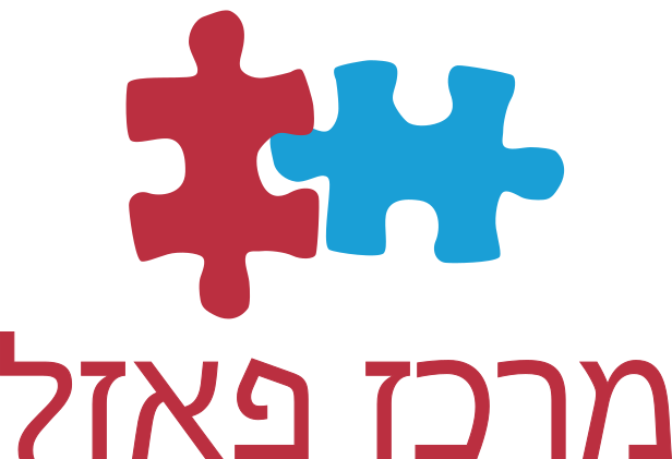
The goal was to create a dynamic and joyful visual identity that feels inherently childlike. Because the center covers everything from education to sports, the design needed to be highly versatile yet instantly recognizable.
To achieve this, I chose a bold, high-contrast palette led by red and blue. The vibrant red injects a sense of energy and movement, while the blue provides a welcoming foundation. Together, they capture the active, fun spirit of the center in a way that naturally resonates with children.
Paid Advertising & Campaign Management

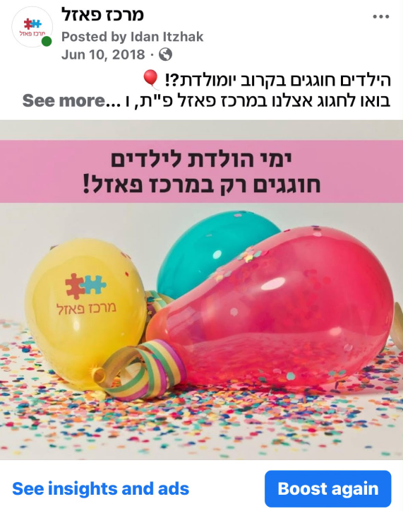
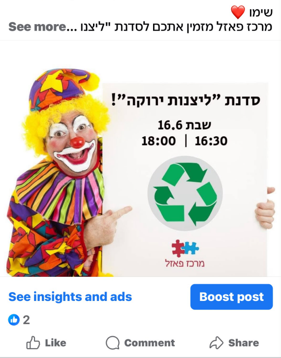
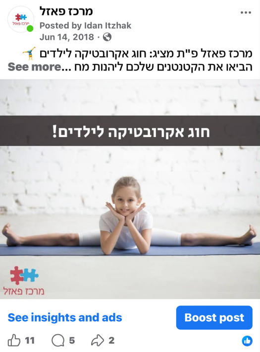
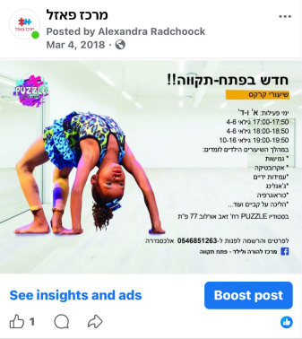
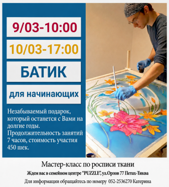
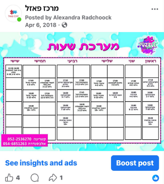
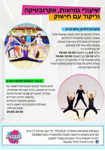
Through my work with PUZZLE, I gained hands-on experience in planning and executing targeted advertising campaigns, specifically on Facebook. I managed budgets, defined audience targeting to reach local families, and monitored campaign performance to optimize engagement. This strategic approach allowed us to effectively promote specific classes, seasonal camps, and events, turning digital reach into direct client enrollment.

A Bit More of the Advertising Campaign

Puzzle Center – Brand Identity & Social Media Management
Project Overview
While living in Israel, I partnered with the founder of PUZZLE, a cultural and community center originally serving the Russian-speaking community. My main role was to expand our reach to Hebrew-speaking Israeli clients.
The center offers children’s language development, art classes, sports, holiday events, and birthday parties. I designed a cohesive brand identity for the local market and managed our digital marketing and client acquisition.
The Challenge & Strategy
The goal was to create a dynamic and joyful visual identity that feels inherently childlike. Because the center covers everything from education to sports, the design needed to be highly versatile yet instantly recognizable.
To achieve this, I chose a bold, high-contrast palette led by red and blue. The vibrant red injects a sense of energy and movement, while the blue provides a welcoming foundation. Together, they capture the active, fun spirit of the center in a way that naturally resonates with children.
Paid Advertising & Campaign Management
Through my work with PUZZLE, I gained hands-on experience in planning and executing targeted advertising campaigns, specifically on Facebook. I managed budgets, defined audience targeting to reach local families, and monitored campaign performance to optimize engagement. This strategic approach allowed us to effectively promote specific classes, seasonal camps, and events, turning digital reach into direct client enrollment.
A Bit More of the Advertising Campaign